You’re constantly looking for ways to differentiate your destination and drive footfall, whilst you might focus on tenant mix, events and promotional campaigns, there’s one critical element that could be undermining or supercharging all your marketing efforts: typography.
At Toolbox Marketing, we’ve seen firsthand how the right typography choices can transform a shopping centre’s brand perception and customer behaviour. Yet it’s often the most overlooked aspect of destination marketing.
Your Font is Your Brand’s First Impression
When a potential visitor sees your marketing materials, whether it’s a digital ad, outdoor billboard or social media post they’re making split-second judgments about your shopping centre. Typography plays a huge role in that instant assessment.
Consider this: if you’re managing a premium shopping destination, but your marketing uses casual, playful fonts, you’re sending mixed signals. Conversely, if you’re trying to attract families but your typography feels cold and corporate, you’re creating barriers before customers even arrive.
The typography you choose becomes your brand’s voice. It tells visitors: “This place is for people like you” or “This isn’t quite right for me.” Getting this alignment right from day one can significantly impact your marketing ROI.
The Legibility Challenge in Retail Environments
Shopping centres present unique typography challenges that many marketing agencies don’t fully understand. Your signage needs to work across multiple contexts:
- Wayfinding systems where stressed parents need to find the nearest bathroom
- Digital displays viewed from various angles and distances
- Promotional materials competing for attention in busy walkways
- Social media content that needs to stop the scroll on mobile devices
We know that sometimes what looks perfect on paper, can fail in the real world. That’s why we always consider the practical application: Will this font work on a backlit sign? Is this easy for all visitors to read?? Does it maintain clarity when scaled down for mobile?
The cost of getting this wrong isn’t just aesthetic, it’s lost sales and frustrated customers who can’t navigate your centre effectively.
Creating Consistency Across Every Touchpoint
As a shopping centre manager, you’re juggling multiple marketing channels simultaneously. Your typography needs to work seamlessly across:
- Traditional advertising (print, radio, outdoor)
- Digital marketing (social media, Google ads, email campaigns)
- In-centre communications (signage, directories, promotional displays)
- Tenant communications and co-marketing materials
Without a consistent typographic system, your brand feels fragmented. Customers might not even consciously notice, but inconsistency erodes trust and recognition over time.
This is where having a destination marketing agency that understands retail environments makes a difference. We help shopping centres develop typography guidelines that work across every application, ensuring your brand feels cohesive whether someone encounters it on Instagram or at your information desk.
Typography That Drives Action
The ultimate goal of your marketing isn’t just brand awareness – it’s getting people through your doors and keeping them there longer. Typography can be a powerful behavioural tool when used strategically.
For example:
- Urgent promotions might benefit from bolder, more condensed fonts that create energy
- Luxury brand partnerships call for elegant, spacious typography that reflects quality
- Family events work better with friendly, approachable typefaces that feel welcoming
- Wayfinding systems need clear, simple fonts that reduce cognitive load
We’ve observed that shoppers respond differently to various typographic treatments, and smart shopping centre managers can use this to their advantage in driving specific behaviours.
The Hidden Cost of Poor Typography Choices
When typography doesn’t work effectively, the consequences ripple through your entire operation:
- Marketing campaigns that don’t convert as well as they should
- Frustrated visitors who can’t find what they’re looking for
- Missed opportunities for impulse purchases
- Brand perception that doesn’t match your positioning
- Reduced word-of-mouth recommendations
Many shopping centre managers don’t realise how much their typography choices impact their bottom line. It’s not just about looking good – it’s about performing better.
Making Typography Work for Your Centre
The good news? Typography is one of the most cost-effective ways to improve your marketing performance. Unlike major renovations or expensive advertising campaigns, getting your fonts right is a strategic investment that pays dividends across every touchpoint.
At Toolbox Marketing, we work with shopping centre managers to develop typography systems that don’t just look professional—they work harder for your business. Whether you’re repositioning an existing centre or launching a new destination, the right typographic foundation can significantly amplify your marketing efforts.
Your typography choices are speaking to customers right now. The question is: are they saying what you want them to say?
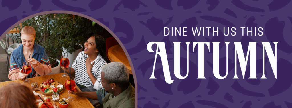
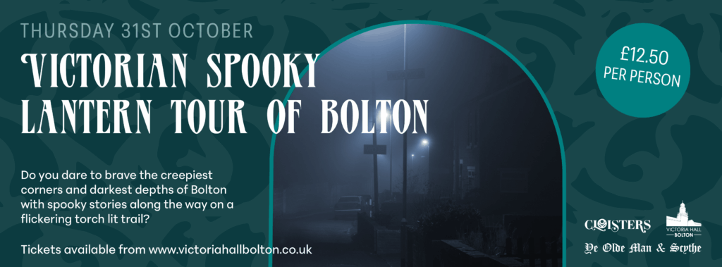
Case Study: Bolton Market Place Typography Transformation
In September 2024, we began our collaboration with Market Place with a vision to breathe new life into the creative assets and deepen their connection to this iconic historic building. Typography was central to this transformation, but it needed to work alongside carefully considered visual elements.
Our approach introduced new design elements that bring the distinctive aspects of the property into the visual narrative. This includes featuring the arch of the building represented in the logo to hold imagery, and the introduction of subtle ornate patterning as a nod to the ironwork architecture of the building.
We developed a three-tier typographic system that perfectly balances this heritage story with contemporary functionality:
Verve Alternate serves as the bold headline font—designed to create strong first impressions that stop visitors in their tracks. This eye-catching typeface immediately communicates energy and confidence whilst complementing the architectural elements.
Peridot PE Variable Narrow handles subheadings with sleek, modern contrast that maintains readability even when scaled down for wayfinding applications or when placed within the distinctive arch framing.
Peridot PE Variable Medium ensures all body copy remains clean and professional across every touchpoint, from digital campaigns to in-centre signage.
To ensure consistency and strengthen brand recognition, we established a cohesive aesthetic across all assets for both digital and print. This unified typographic approach elevates the brand presence and delivers a powerful, recognisable message that works seamlessly with our carefully selected imagery style that perfectly aligns with the scheme, tenant mix and target audience.
The result? A typography system that works seamlessly across 36 different on-site applications—from car park entrance signs to toilet door displays—whilst maintaining brand consistency across seasonal marketing campaigns and both brand and tactical messaging. The fonts successfully bridge the gap between the centre’s historic architecture and its vibrant, modern retail offerings.

Ready to explore how typography could be working harder for your shopping centre? At Toolbox Marketing, we specialise in helping shopping destinations create cohesive, effective marketing strategies that drive real results. Get in touch to discuss your next campaign.