How colour shapes the way we feel and shop.
In retail, the small things often make the biggest difference. The layout, lighting, music and yes, the colours you surround your customers with. We usually think of colour as just a design element, but it’s way more than that. Colour affects mood, perception, and even how willing someone is to buy.
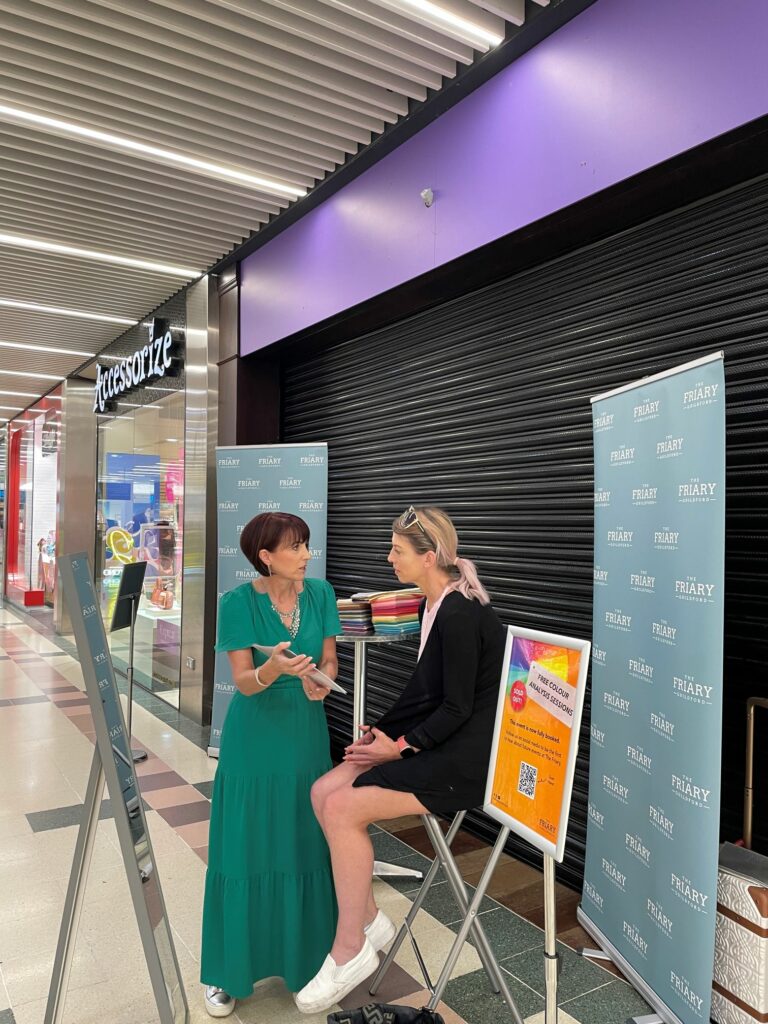
We got a real taste of this recently at The Friary Guildford, during our “Style Starts With Hue” event. It was a two-day colour analysis pop-up with local stylist Kerrie Ellis and it sold out fast. All 35 daily sessions were gone in within a week. People were clearly curious about how colour plays a role in their lives (and wardrobes).
Everyone who attended got a personal colour palette that highlighted which tones worked best for them, plus product suggestions from our retailers, and a QR code linking to styling ideas and seasonal trends.
It wasn’t just about “what looks good.” It was about giving people the tools to make better shopping decisions, ones that feel more them. We saw people leave feeling confident, excited, and, honestly, a little empowered.
And from a retail perspective? We noticed more browsing, more sharing, and more people exploring stores they hadn’t planned to visit. That’s the kind of engagement every centre wants.
Colours and Emotions: A Quick Guide
Here’s how some common colours tend to influence how people feel and act in retail:
- Red: Bold, urgent, energetic. Great for sales, less so for spas.
- Blue: Trustworthy and calm. Think banks, tech brands, or skincare aisles.
- Yellow: Bright, happy, a bit loud. Can be fun, or overwhelming.
- Green: Natural and peaceful. Works well for wellness, organic, or eco-based brands.
- Orange: Warm, friendly, full of life. Not for every brand, but great when it fits.
- Purple: Fancy, creative, a touch mysterious. Often used in luxury or beauty.
- Black: Clean, sleek, powerful. Think high-end or minimalist.
- White: Fresh, simple, and honest. Makes products pop — or rooms feel sparse.
How Colour Shapes Customer Behaviour
Influencing Mood
Warm tones like red, orange, and yellow can energise a space, which can be great for fast decision-making or sales zones. Cooler tones – blues and greens – slow things down, often encouraging shoppers to relax, browse, and consider.
Shaping Perceptions
The colours you use in signage, branding, or packaging say a lot about your business. They help signal whether your brand is playful, premium, eco-conscious, or reliable.
Directing Attention
Want to highlight a deal or a new arrival? Bright or contrasting colours can draw the eye exactly where you want it, guiding foot traffic and boosting engagement.
Don’t Forget Cultural Nuance
While colour psychology provides useful general insights, it’s not one-size-fits-all. Different cultures associate colours with different meanings. For example, white is often seen as pure in Western contexts, but it can represent mourning in some Eastern traditions. For retailers with a global reach, being culturally aware is just as important as being colour-savvy.

Quick Tips for Using Colour in Retail
- Be intentional. Choose colours that reflect your brand’s personality and evoke the feelings you want to inspire.
- Test and tweak. Try different combinations in digital ads, signage, or displays, and watch how customers respond.
- Find the balance. Too many bold colours can be overwhelming. Use neutrals to create breathing room.
- Think holistically. Lighting, textures, and surrounding colours all influence how a hue is perceived.
- Get personal. Empower customers with tools or experiences (like styling sessions) to help them understand colour on a deeper level.
Colour in retail isn’t just decoration – it’s a strategy. Used well, it has the power to shape the shopping experience, boost brand loyalty, and drive sales. As we saw at our recent event, when we give shoppers the knowledge and confidence to embrace the colours that work for them, we do more than sell – we build community, spark joy, and turn everyday retail into something memorable.